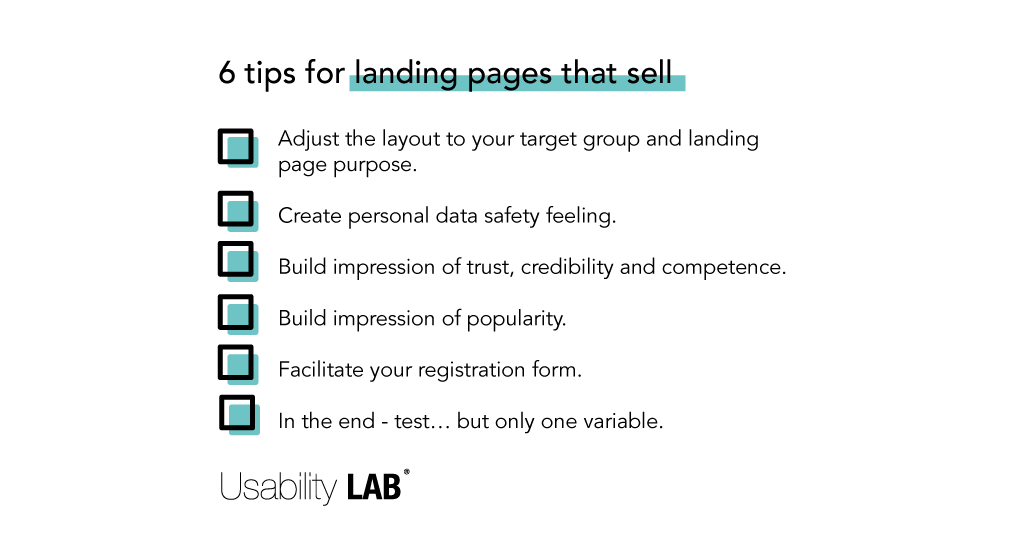
No matter if you have a standalone landing page for gaining subscribers or if you have multiple pages in your e-commerce – there are some universal tips & tricks that might help you optimize them. Here are six most important ones.
Adjust the layout to your target group and landing page purpose
This page looks ugly… How many times have you heard that line? From your graphic designers, IT developers, or even your CEO?
The layout does not have to be pretty – it needs to sell, gain subscribers or leads, not to compete in a design contest. Sometimes sophisticated graphic forms just distract your users.
Adjust the layout to your target group, but most of all – make everything clear. What is the purpose of this page? Why is a user here? What should they do next? And why should they do it? What is the USP? Design your page in a way so they can easily answer all the questions spending the least amount of time on your LP.
You cannot complete a form when you do not know how to find it. A place with data inputs or CTA button should be easily found and visible on the page. The best case scenario is when your landing page fits on one screen. But if it is not possible, do not hesitate to repeat data inputs or CTA button in several places on the page – to make it visible for a user every time they scroll through it.
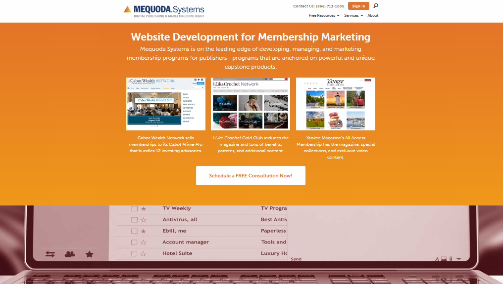
Mequoda.com - a very long landing page with CTA on every screen - it has got 6 screens and 6 CTAs
Your landing page should not include any links to external pages that will redirect the traffic from your page. Blur or remove your heading (if your landing page is a part of the bigger website). If you really must have external links (like a link to the privacy policy), make sure that they open in new browser windows.
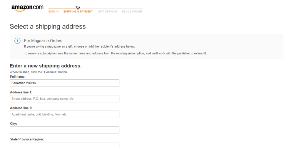
Amazon cart - Only a logo remains in the heading and it is unclickable
Create the feeling that personal data is safe
In the area of privacy, by default, it is still important to guarantee that a user’s personal data will not leak, be distributed or sold to third parties for further promotional purposes (or to other shady businesses).
Show links to privacy or user agreement policies in visible spots. Make them easily reachable. You may also use some infographics like a crossed-out “SPAM” symbol, security certificates, or memberships in personal data protection organizations.
There are some companies that even put statements like “We will not sell your data” but personally, I think it is an overkill.
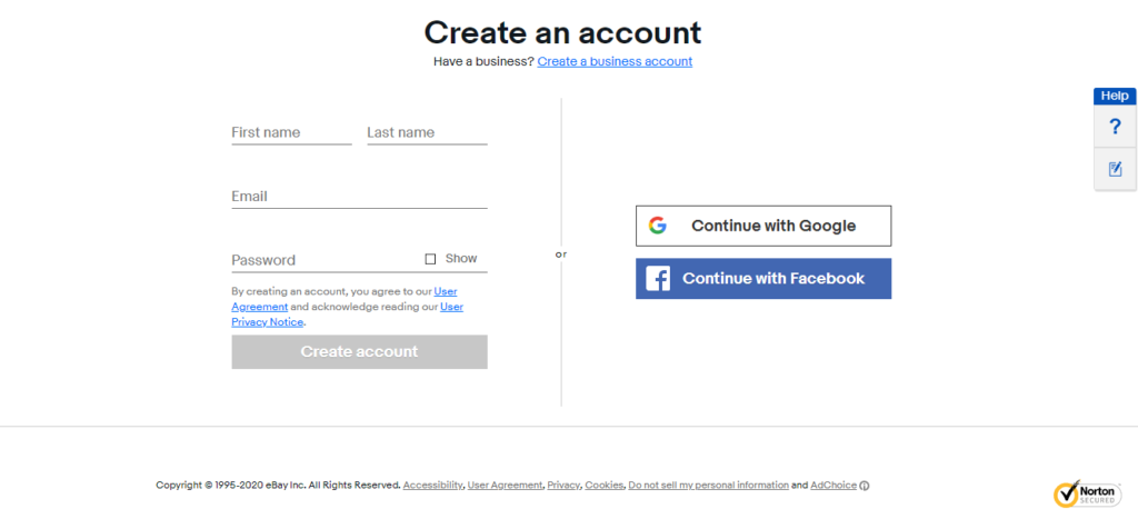
Ebay.com - links to User Agreement and Privacy Policy are easily accessible, plus there is a Norton security icon to enhance trust
Build the impression of trust, credibility and competence
We trust someone because we feel that they are an expert in their field or in the industry. Think about all the elements that will make both the landing page and the company look trustworthy in your industry.
Add well-known brands of your clients or customers, show the industry associations you work with or support. If you’ve earned rewards or certificates that are recognizable in your industry, show their infographics.
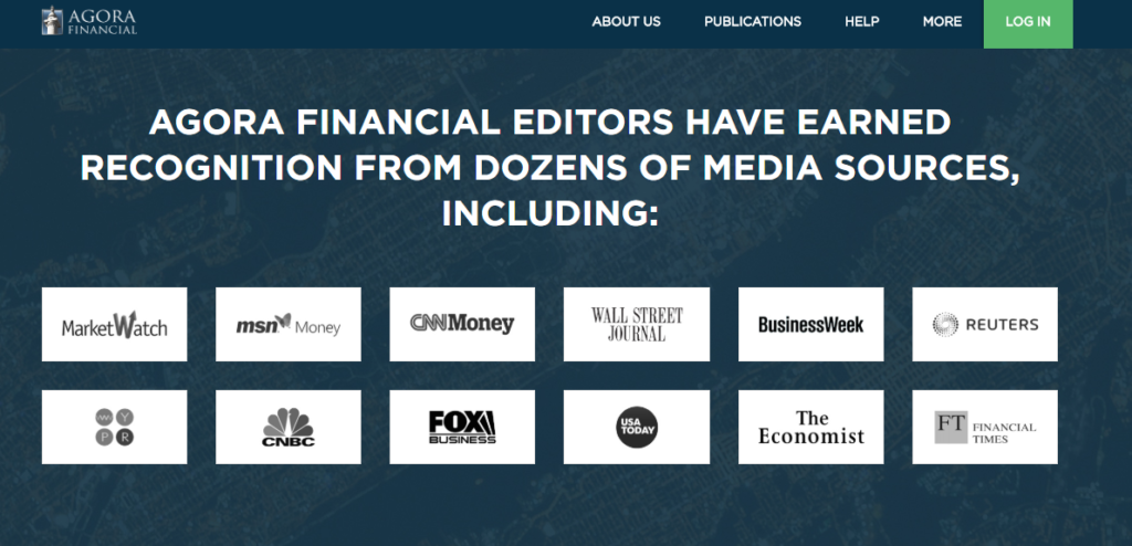
Agora Financial - showing recognizable clients
Ask your best clients for testimonials, especially describing how your product or service helped them solve their problems. The best testimonials are real use cases. If you are allowed to, include their real names and job positions – in the era of fake news, it will make them credible.
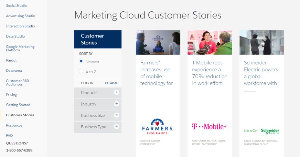
Salesforce Marketing Cloud - a good example of testimonial presentation
Build the impression of popularity
There is no better recommendation than showing that there are lots of other people who use your product or service.
How to do it on a limited space of your landing page?
Show statistics that will make a good impression like: “100,000 customers already registered”, “We served 4,500 clients so far”, “Join 50,000 industry professionals”.
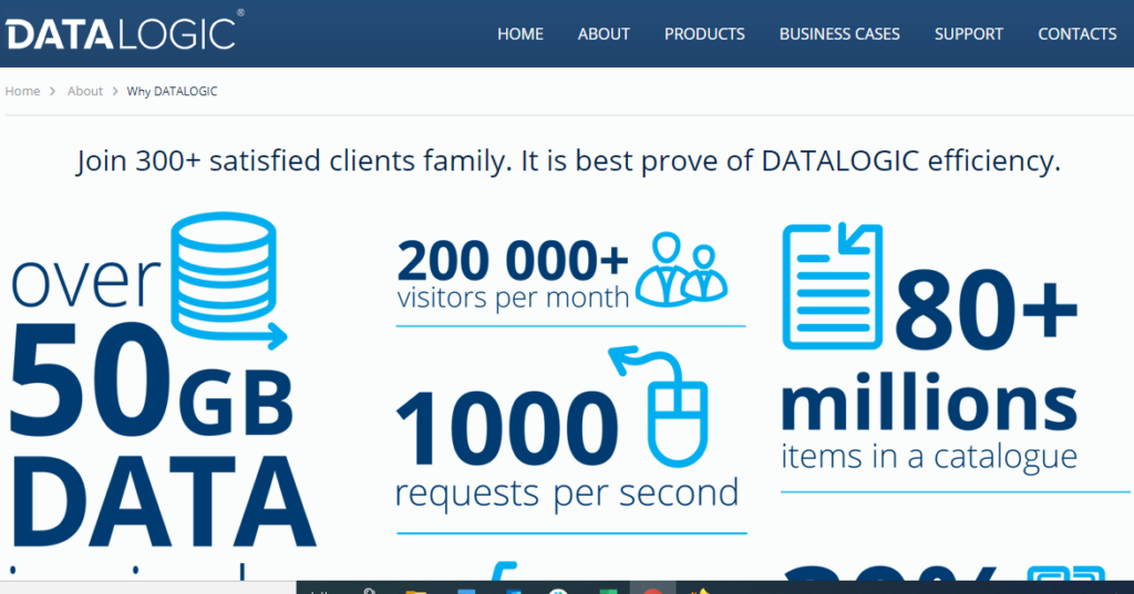
Data logic software - a good example of showing convincing statistics for making popularity impression
Facilitate your registration form
This is the most important cause of loss of potential customers. An invalid registration form will destroy all the efforts put into traffic acquisition.
The rule to follow here is quite simple – the less data we ask for, the more leads or customers we can expect. We created the landing page and it has a lot of data inputs. Now is the time to ask ourselves – do we really need all that data from our customers?
The best way is to leave only the data that is crucial for our product or service delivery.
But if we cannot remove anything, and the form must include a lot of inputs, we have two options.
Option number one – we may divide the form into 2 or 3 steps – therefore a user isn’t intimidated by the number of inputs that must be completed at the same time. If we follow this step, make sure that every screen has the same layout and the same “next” button leading to the next step.
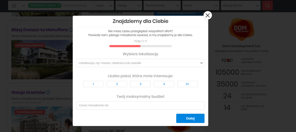
Rynekpierwotny.pl - a two step registration form
Option number two – we ask only for the data that will enable further contact – i.e. e-mail / phone number. After that, when we have a user in our database, we ask for additional data via pop-ups, web surveys, or even customer service phone calls.
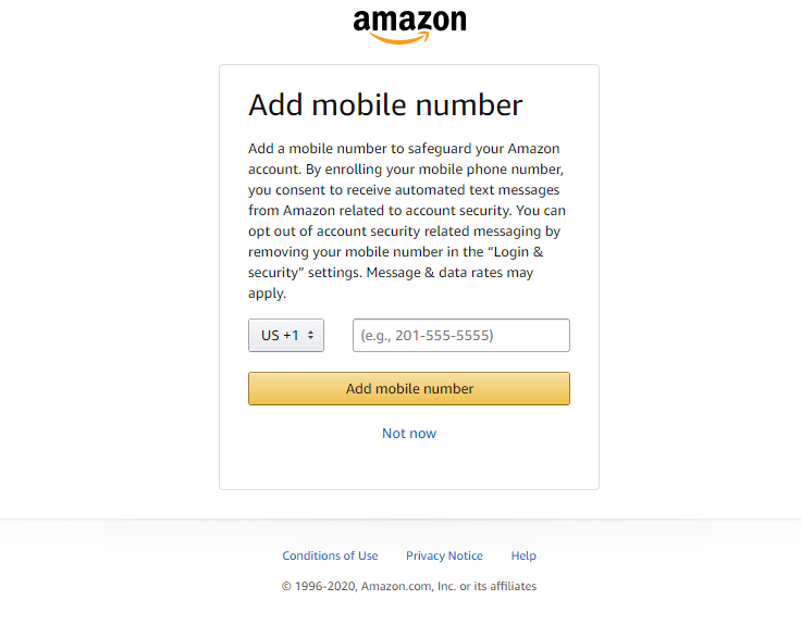
Amazon.com - a good example of asking for additional data after registration or login
In the end – test… but only one variable at a time
We all know the importance of A/B testing, especially when landing pages are considered. The version with best performance should be your next control version, not “the most beautiful” one.
Just remember to test only one variable at a time. We know that in performance marketing, there are four variables that matter – offer, target group, time, and copy design. Therefore, you might test a price, a subscription period, a layout, registration form steps, etc. But if you e.g. test both the design and the offer – you will not know what the winning factor was.